Thursday, November 29, 2012

Post 70- Twitter Feed


The Twitter Feed is something I'm pretty proud of. I will admit, there was some treaking that needed to be done.

I actually had to change the size of the document so that it would fit in the dimensions of the site.

The only thing I'm really wondering about is if I should have made the bar much longer than it actually is. I may very well make it longer in the corrections.

Post 69 - Twitter Analysis

"Twitter Ticker"
Since the Twitter ticker is something I want to implement on my site, I did a bit of research on how Twitter pages and font looks, which was very easy, since it involved copying and pasting type.

I also know my ticker will likely end up being thin, so it doesn't take up much space on the page.

I will say I would have prefered a vertical format, but the other way works just as well.

Post 68 - Flash Example 4

"Doble Fine Flash"
I really like the navigation bar on this site. The way that it's done here is that when you highlight an option, a scroll down menu will appear so you can go to sub pages.

This makes navigation of the site very quick and easy, so you're not clicking through various pages on the site.

Efficiency is a good thing that a site should have.

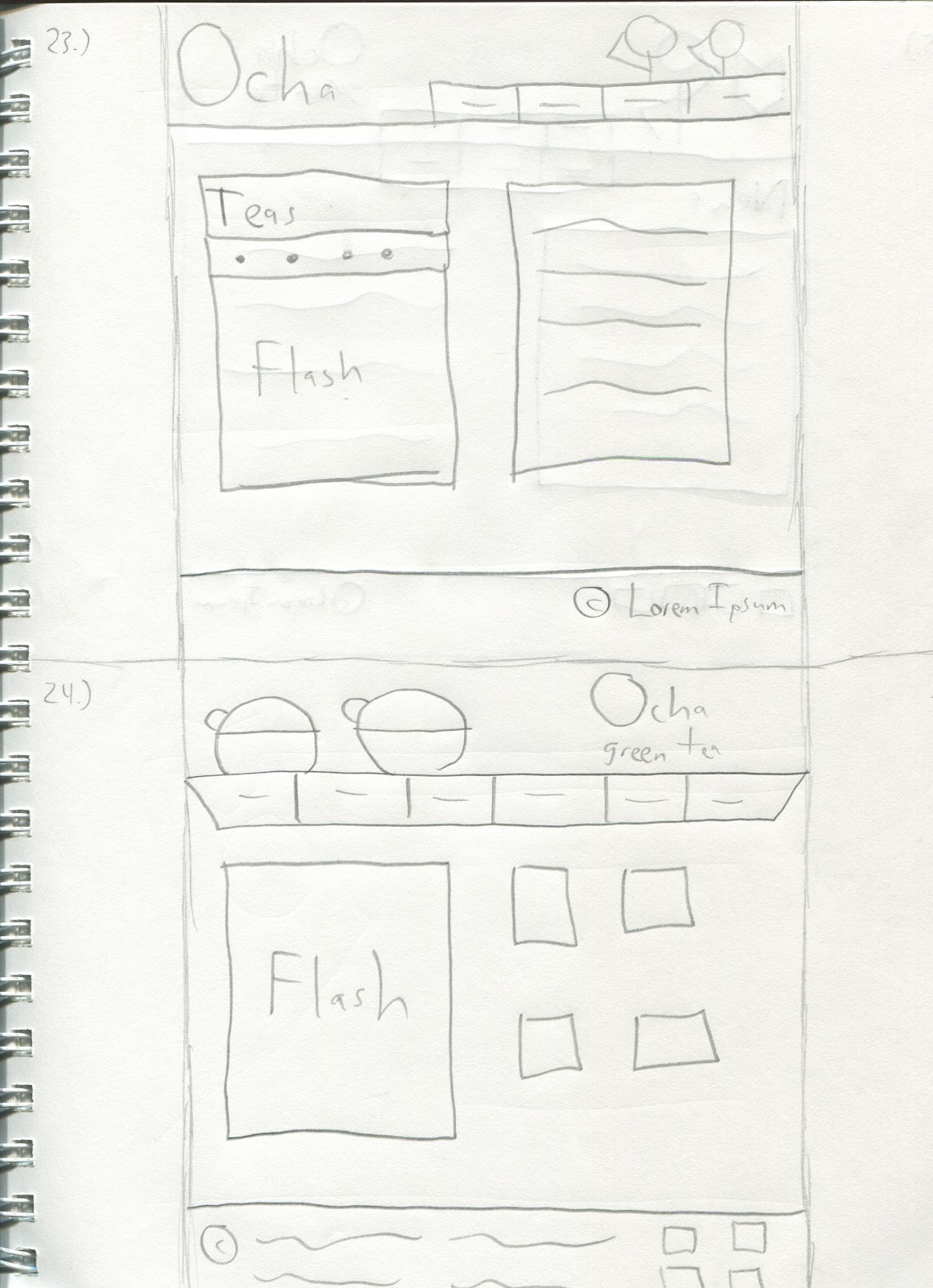
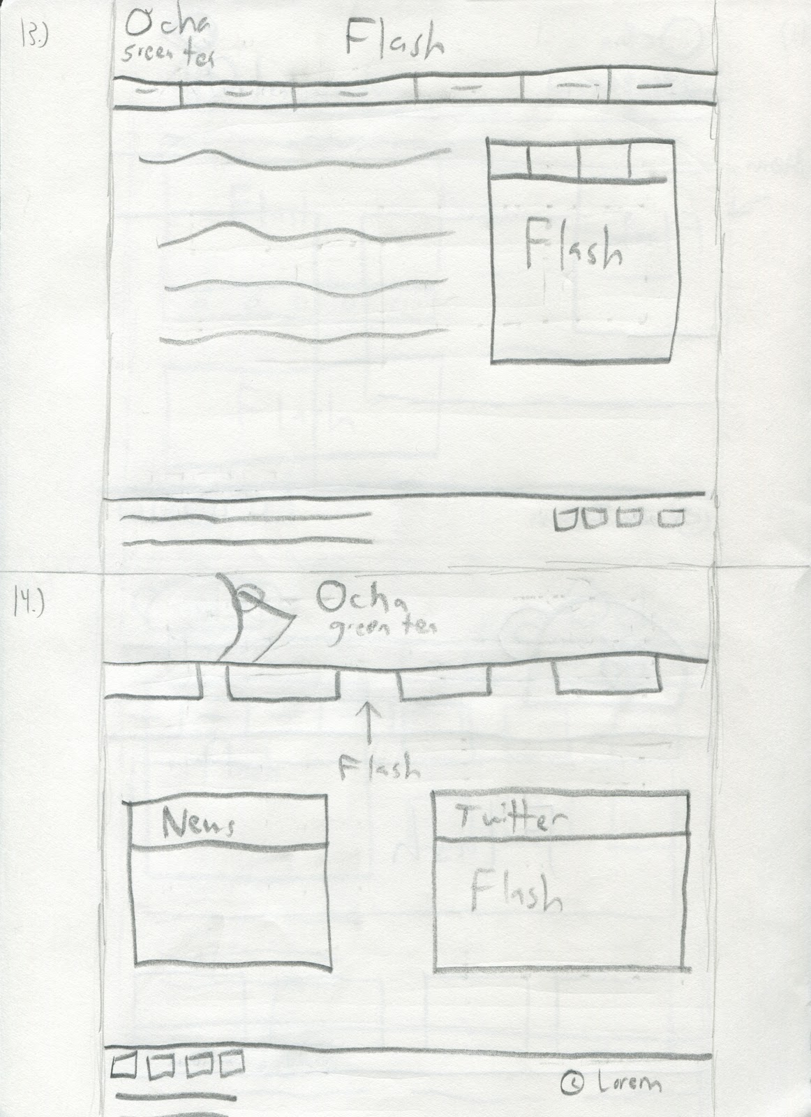
Post 67 - Flash Site Sketches 3

I will say that I'm expecting the things I've drawn here to be a lot like my previous website: a fourth will make it in. That's not really a bad thing though.

The website is a puzzle. It's just a matter of finding the right pieces that fit.


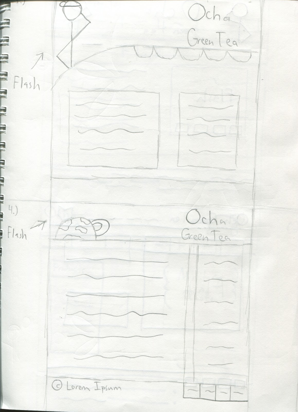
Post 66 - Flash Site Sketches 2

This is a continuation of the sketches I've done so far. I will say having the Tea tank that's present here is something I want to do with my actual website.

It goes well with the whole army angle of my site.


Post 65 - Flash Site Sketches 1

The Sketches present here kind of show that, because of doing the previous projects before, I did end up rehashing old ideas from my first crop of sketches.

But that's okay. What doesn't work there may very well work here.


Post 64 - Flash Example 3

"Yahoo Site"
The flash here is much like IGN's flash portion, except they've added arrows for even more stories. This allows to have more information and still have room for other information.

I like how this was implemented.