Tuesday, November 27, 2012

Post 51 - Advertisement Research 2

"Banner Example"

"Skyscraper Example"

"Square Pop -Up Example"

 
With this set of examples, the banner and the square pop up are for the same thing, but with variations based on their format. This shows that you don't need to really use different ideas for each style. You can just alter and tweak a pre-existing format to fit your given advertising method.

Thursday, October 25, 2012

Post 50 - Advertisement Concepts

"Concept Page 1"

"Concept Page 2"

"Concept Page 3"

"Concept Page 4"

"Concept Page 5"


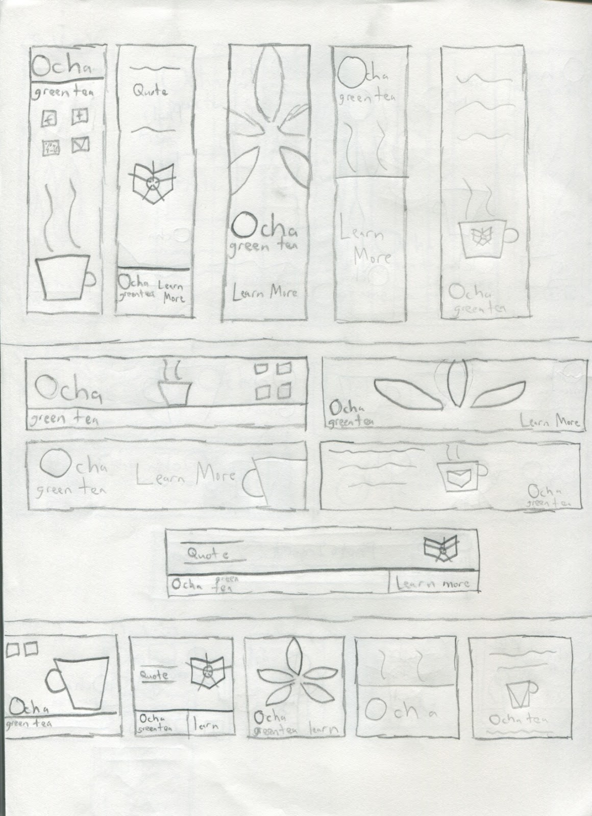
The conceptual phase of the advertisement project was easier than I thought. Since it was supposed to be 75 drawings, I was nervous. However, I ended up doing 25 concepts and fitted them to the different formats. Once I did that, the concept drawings became easy.

Of the 25, I was surprised that 21 actually worked over all 3 formats. The Ocha Army concept could work from a graphic and flash standpoint.

The project itself would require a lot of illustrator work first, but I'm not worried.

Post 49 - Banner Study

"Banner Examples"
The thing that I really like from this group is the photo present in the Pumpkinville advertisement.

It's not really the picture itself that I like, but putting a picture into my advertisement. I notice that alot of Web advertising does this, and I think I might do this for my banner design.

Post 48 - Advertisement Research

I went and searched my usual site for advertisements, and that was easier than I expected.


"Skyscraper Example"

"Square Pop-Up Example"

"Banner Example"

From what I see here, it's all a mix of either type or graphics. It actuall seems alot better than what I expected originally. The square pop ups seem to allow for more graphics than either the skyscraper or banner set-ups.

I think that right now, the pop-up will be the easier of the 3 to design for.

Post 47 - Project 3 Thoughts

Web Advertisements

Project:
Create three flash advertisements for Ocha Green Tea. The ads will appear on various websites on the internet. Be sure to carry your brand image into each of the ads. Consider who is viewing the advertisements and market them accordingly.
The ads will be several different sizes. They are:
Skyscraper – 120x600px
Full Banner 468x60px
Square pop up – 250x250px
Objectives:
Understand how advertising for the web is different than print advertising. Discover ways to market your product and continue the brand image. Know how to layout web advertisements in Flash
Thumbs due: Oct. 25
Project due: Nov. 6


This project seems alot like project 1, and that might work in my favor. Since it mostly uses flash, I'm comfortable with the parameters. 2 years of using the program puts it on par with Illustrator and photoshop for me, so I shouldn't have too much trouble with this project.

Post 46 - Site Critique

My final site, while being one of my better works, does need some corrections for the final critique. I need to:

  • Change Font for headlines and body copy
  • Lose brown bar on history page
  • Match nav to bottom of Ocha
  • Add Green Headlines
  • Change Contact Info to contact
Most of the problems here involve simple design flaws. I remember when it was the technical stuff that I lost points on. The fact that it's not the case here means I'm getting better.

Post 45 - Final Website

"Site 1"


"Site 2"


"Site 3"

My final site actually turned out nicely. As I was going through doing the site, there was some doubts with working with the program. However, this turned out very nicely.

I will say that looking back, doing Lorem Ipsum saved me alot of time. I remember with my previous projects, trying to come up with new things screwed me up.

By not doing that, I saved some time.