Thursday, October 25, 2012

Post 50 - Advertisement Concepts

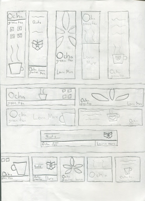
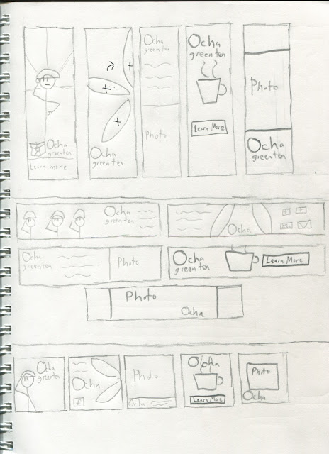
"Concept Page 1"

"Concept Page 2"

"Concept Page 3"

"Concept Page 4"

"Concept Page 5"


The conceptual phase of the advertisement project was easier than I thought. Since it was supposed to be 75 drawings, I was nervous. However, I ended up doing 25 concepts and fitted them to the different formats. Once I did that, the concept drawings became easy.

Of the 25, I was surprised that 21 actually worked over all 3 formats. The Ocha Army concept could work from a graphic and flash standpoint.

The project itself would require a lot of illustrator work first, but I'm not worried.

Post 49 - Banner Study

"Banner Examples"
The thing that I really like from this group is the photo present in the Pumpkinville advertisement.

It's not really the picture itself that I like, but putting a picture into my advertisement. I notice that alot of Web advertising does this, and I think I might do this for my banner design.

Post 48 - Advertisement Research

I went and searched my usual site for advertisements, and that was easier than I expected.


"Skyscraper Example"

"Square Pop-Up Example"

"Banner Example"

From what I see here, it's all a mix of either type or graphics. It actuall seems alot better than what I expected originally. The square pop ups seem to allow for more graphics than either the skyscraper or banner set-ups.

I think that right now, the pop-up will be the easier of the 3 to design for.

Post 47 - Project 3 Thoughts

Web Advertisements

Project:
Create three flash advertisements for Ocha Green Tea. The ads will appear on various websites on the internet. Be sure to carry your brand image into each of the ads. Consider who is viewing the advertisements and market them accordingly.
The ads will be several different sizes. They are:
Skyscraper – 120x600px
Full Banner 468x60px
Square pop up – 250x250px
Objectives:
Understand how advertising for the web is different than print advertising. Discover ways to market your product and continue the brand image. Know how to layout web advertisements in Flash
Thumbs due: Oct. 25
Project due: Nov. 6


This project seems alot like project 1, and that might work in my favor. Since it mostly uses flash, I'm comfortable with the parameters. 2 years of using the program puts it on par with Illustrator and photoshop for me, so I shouldn't have too much trouble with this project.

Post 46 - Site Critique

My final site, while being one of my better works, does need some corrections for the final critique. I need to:

  • Change Font for headlines and body copy
  • Lose brown bar on history page
  • Match nav to bottom of Ocha
  • Add Green Headlines
  • Change Contact Info to contact
Most of the problems here involve simple design flaws. I remember when it was the technical stuff that I lost points on. The fact that it's not the case here means I'm getting better.

Post 45 - Final Website

"Site 1"


"Site 2"


"Site 3"

My final site actually turned out nicely. As I was going through doing the site, there was some doubts with working with the program. However, this turned out very nicely.

I will say that looking back, doing Lorem Ipsum saved me alot of time. I remember with my previous projects, trying to come up with new things screwed me up.

By not doing that, I saved some time.

Wednesday, October 24, 2012

Post 44 - Footer Examples 2

 
"Picture Footer"
I like how this footer uses pictures for the important portions.  Most footers I've come across just use alot of text. I like this footer for it's originality.


"Dell Footer"
I feel that this is one of the footers that suffers from being too wordy. I'm aware that in most cases, the footer includes the more technical information on the site.

However, I feel that that should be interesting as well. The whole site should be.

Post 43 - Navigation Bar Examples 2

I found this one particular image online. I have to say, these are some really good examples on what to do differently with navigation bars.
"Navigation Examples"
First off, these navigation bars are much more design oriented than most sites use. The majority of them have a highlight option on the bar. That is something I didn't do, but can do for the final critique.

Of the group, my favorite would have to be the middle bar. It reminds me of a game controller joystick to a certain extent.

While that is a silly reason, design wise, I like it.

Post 42 - Site Tutorials 2


Video is something we'll most likely experiment with coming soon in Web Design. This was another opportunity to get some info on how to do this.

I'm keeping these videos here as a reference that I can go back to when the time comes.

Post 41 - Animated Logo Edit

I remember when I went through my critique, there were a few things that I needed to correct.
  • Timing
  • Alignment
  • Color
In concerns to timing, the overall speed of the letters fading in to the scene were partially off. I went back and corrected this for my final Critique.

Alignment took a little longer. "Ocha" and "Green Tea" needed to be aligned with the bottom and top of my logo so it felt consistent.

Finally, I was told to experiment with my coloring of my logo. I chose not to do that.

I remember during my creation phase, I did experiment with using brown and green together in the logo. It didn't work.

Post 40 - Bad Websites 3

Most websites that have bad web design are like that for 1 of 2 reasons.

1.) Inexperience

2.) Indifference


"Arngren Site"
This site is a good example of the indifference reason. It just displays the products without any rhyme or reasion to the layout. Nothing feels related and it comes off as being done at the last moment.

If you were to add more products, doing so would be difficult and could screw up the site even more than it is now.

The worst thing a designer can do is to just not care.

Monday, October 22, 2012

Post 39 - Site Tutorials


I'm aware that further into the course, we will be doing a flash website. With that in mind, I decided to brush up on some things as well as get into something new early.

I find the video that talks about Favicons is useful, because when I go through the fourth project, I can try this.

Post 38 - Site Progress 2

"Ocha Site 1"


"Ocha Site 2"

So far, I'm proud of how this site has turned out. Design wise, I feel this is like an actual site you could find for a business. With my previous projects, I didn't get that feeling.

I also like how the brown areas turned out. I remember trying to find the best color for those areas, so I had to experiment until I found the best colors.

Overall, I think this is the best site I've made design wise so far.

Post 37 - Previous Works

In order to improve your skills as a designer, it';s sometimes neccesary to go back to previous projects and see what went wrong and what worked. Thankfully, I save my projects.

"Web Design Midterm"
I'm starting here because this was probably my favorite web design I did in the class originally. There were design sensibilities here than there were with my other sights. This is likely because I was busy with focusing on function instead of form.

I also feel this went with the sights design and purpose pretty well.

"Nerd Neccesities"
The concept of this sight seemed like a good idea at the time. However, the execution and content had something to be desired.

I remember that I spent too much time focusing on the content, when I could have just used Lorem Ipsum.

This was also at a time I was getting used to using the program, and I wasn't very confident in using it since it was more programming based than I expected. I need to return to this at some point.


Sunday, October 21, 2012

Post 36 - Header Examples 2

So far, site headers are my favorite part of developing a site. It's the first thing that a viewer sees, and it can decide subtly if a viewer stays. The examples below are some good examples.


"Creative Commons Header"
Creative Commons has some gradient coloring in the header. In the past, I've done gradients for my designs, and in the past, it hasn't worked. Here, it does. It's no distracting, and it's subtle.


"Barnes and Noble Header"


Barnes and Noble is a more uniform header. It's just a plain white with the logo on it, but it feels fancy in doing so. I can't put my finger on it, but it looks fairly nice.


'Dizzain Header"
This header is very visually interesting. Using an image for a header is an option that all designers have available. While the header comes off as a bit big, it's justified with the visual header here.
This sort of thing is cool to look at, and can keep a viewer for a few more seconds.

Post 35 - Tea Sites 2

The tea sites I viewed while doing more research started to have similar visual and content sensibilities.

"Tea Navigator Site"

Tea Navigator has a good use of color here. There's also simplicity present here, and most of the sites I've gone to keep things simple.

The Orange that's present here gives me the idea to try using orange in my site since orange and green seem to go well here.


"Blooming Tea Site"

Blooming Tea may very well be too simple. While I do like the subdued colors, I feel there should be something more visual going on here. I do, however, like the social media incorporated on the side.

From the sites I viewed, some put social media on the side, and some put it on the bottom. My design used the bottom for this, but this is one of the instances that it works here.

Post 34 - Bad Websites 2

I decided to find some more examples of bad sites, and honestly, it wasn't hard.

"Furniture Site"

This sites problem is that there was no design incorporated into it at all. When you get someone to view your site, professionalism should be apparent. Here, it clearly isn't.


"Mariner Site"
The big issue with the Mariner Site is the coloring. The colors here are either too dark or too bright. Because of this, the sight becomes an eyesore.

When creating a site, the site shouldn't hurt your eyes. That's the kind of thing that pushes people away.

Post 33 - Site Progress

"Site Progress 1"
Overall, my current site layout os going nicely. The brown I wanted to incorporate into my site design turned out looking good. I originally had it at a much darker tone, but the duller colors work better.

I will say the only thing I currently don't like here is the fact that I had to seperate my logo in the way I did, as well as change the logo colors.

However, sometime getting out of the comfort zone is the best thing for a designer. I'm not sure it'll work, but I can only hope.

Post 32 - Footer Examples


"Design Shack Footer"


"University of Massachusetts Footer"


"Footer Example Set-up"


When it comes to the footer, it's mostly made up of technical information and links. My research just showed me general set-up that could be expected.

The Design Shack Footer, while giving you some good info, is too tall. The most important things can be kept, but the other things can be discarded or moved to other areas on the site.

The University of Massachusetts footer includes the copyright statement, as well as site policies.

The same can be said for the example below it. This is one of the only real situations that centered type is visually allowed on a site design.

Post 31 - Bad Websites

 When I typed up bad website design, I was expecting minor bad design. I was dead wrong.


"Bad Example 1"


Bad example 1 has the problem of not being consistent. Nothing looks like it connects, and everything feels cramped and cluttered.

The amount of different colors present also make the site an eyesore, and that pushes people away from viewing a site. 
 
"Bad Example 2"

Bad example 2 is cluttered like Bax example 1, but for a different reason. The site is too wordy.

When a site is too wordy, the viewer can become bored. A site should be visually stimulating as well as mentally. If you go too far in the mental direction, it evokes a textbook.

It's that sort of thing that bores people, and when designing a website, that shoud be avoided.


Post 30 - Favorite Sites

Much like my favorite logos, I looked at my favorite sites for inspiration as well.

"Kotaku Site"
The Kotaku site mostly has it's articles on the left and other articles on the right. The leftmost article takes up the whole area, and the right just serves to show what else there is to read. Simple, yet efficient.


"Cracked Site"

The Cracked site works mostly the same way. However, I do feel there are more areas in the body area than most sites. AT times, this can get confusing, so streamlining might be a good idea for the future of the site.


"IGN Site"
The IGN site is probably one of the better sites I go to. It's streamlined, and fairly pleasent to look at.

They also seem to have organization down pat, so that's somethin to look into.

Post 29 - Tea Sites


I found that when it came to finding tea sites, it provided me with some overall insight on how the sites were generally structured and what could be found on them.

"Tea and Meal Site"
The Tea and Meal site was very simple. I noticed that the reccomended dishes area could be cool to emulate to a certain extent, but with tea recipes instead. I also like the subdued greens that are present here. They're nice to look at here, and not all that distracting.

"Republic of Tea Site"
This site also uses the subdued green that was present in the previous site. This site in particular also uses the overlapping symbol that I mentioned in one of my previous posts. This was something I wanted to incorporate into my site, and I still intend to do that.


"Adagio Teas Site"

WHile the Adagio site uses orange mostly, I really do like the symbols that are buttons. WHile I most likely won't do this for my final site, I will say I could try that for one of the future projects. It's something to think about to say the least.

Post 28 - Final Site Idea


"Site Concept 11"


"Site Concept 12"

"Site Concept 13"


As I stated before, my final site idea will actually be a mix of the ideas I purveyed in my previous drawings.

I was actually expecting it to be more akin to my previous project, the Logo project.

With that project, I had an absolute idea what the final logo was bringing it into Illustrator. That isn't the case here.

I have no real idea what the final site will look like in illustrator, so it will be interesting to see the final result of my work.

Post 27 - Header Examples

"Eco Environments Header"
"David Schiff Header"
"Realty Drive Header"

These 3 headers actually provide some insight on the overall set-up of the header.

With the Eco Environments header, the header itself is much larger than usual. This is useful if you want the header to apply some artistic elements to your site, because then you have more room for that.

The David Schiff header is much simpler. It just gets the general idea across about the site, as well as the main focus: The artist.

The final header, the Realty Drive, actually puts the header below the navigation bar. WHile this seems weird, it's actually a refreshing change of pace.

I could try doing this in my website, but I would have to test it first. It would be different, so that could be cool.

Post 26 - Site Colors

"Green and Brown Business Card"
While coming up with ideas for my site coloring, I found this business card that had some nice coloring to it.

I remember that using browns with my logo came up during the class critique, and I think I'll use this sort of coloring for my overall site design.

I'm feeling I should go with green on a brown background. That will probably be what I go with in the end.

Post 25 - Site Sketches 2

"Site Concept 6"


"Site Concept 7"


"Site Concept 8"


"Site Concept 9"


"Site Concept 10"


I've come to realize that the majority of what I have here won't become the actual site that I use.

I realize that most likely, I'll just be using the bits and pieces from each idea that works, and eventually make a sort of franken-site.

There are bits that I like here, and I'll use them in my final site.